Hey there every peoples.
It’s a… it’s been a while. *checks archive* Yep, 7 years. I wish I could say a lot has happened in that time. But not that much. The most noteworthy change in my life is in 2021 I moved to Texas to finally live the dream of being a paleontologist. But only for 15 months before I royally fucked it up. So now im more miserable than ever but that’s neither here nor now.
Why did I stop blogging? Mainly it just lost its fulfillment. I got wrapped up in other hobbies and life stuff and the time it took to write stuff just didn’t feel worth it. Plus I just felt there were people who did it far better than me and I had so few readers and subscribers that I figured no one would notice if I left. But I’ve come because there is something I just need to talk about. See for my 35 birthday I took little trip down to Houston. One of the things I did was visit the Houston Museum of Natural Sciences, in part for their huge paleontology hall. And hoo boy, there was so much wrong that I just had to necro the old cyber rag to rant about it.
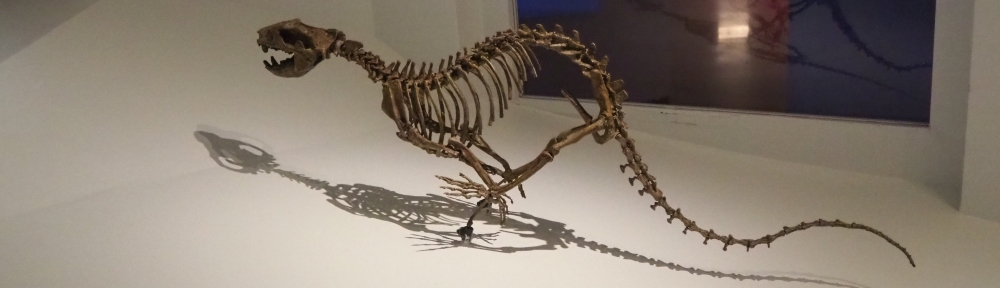
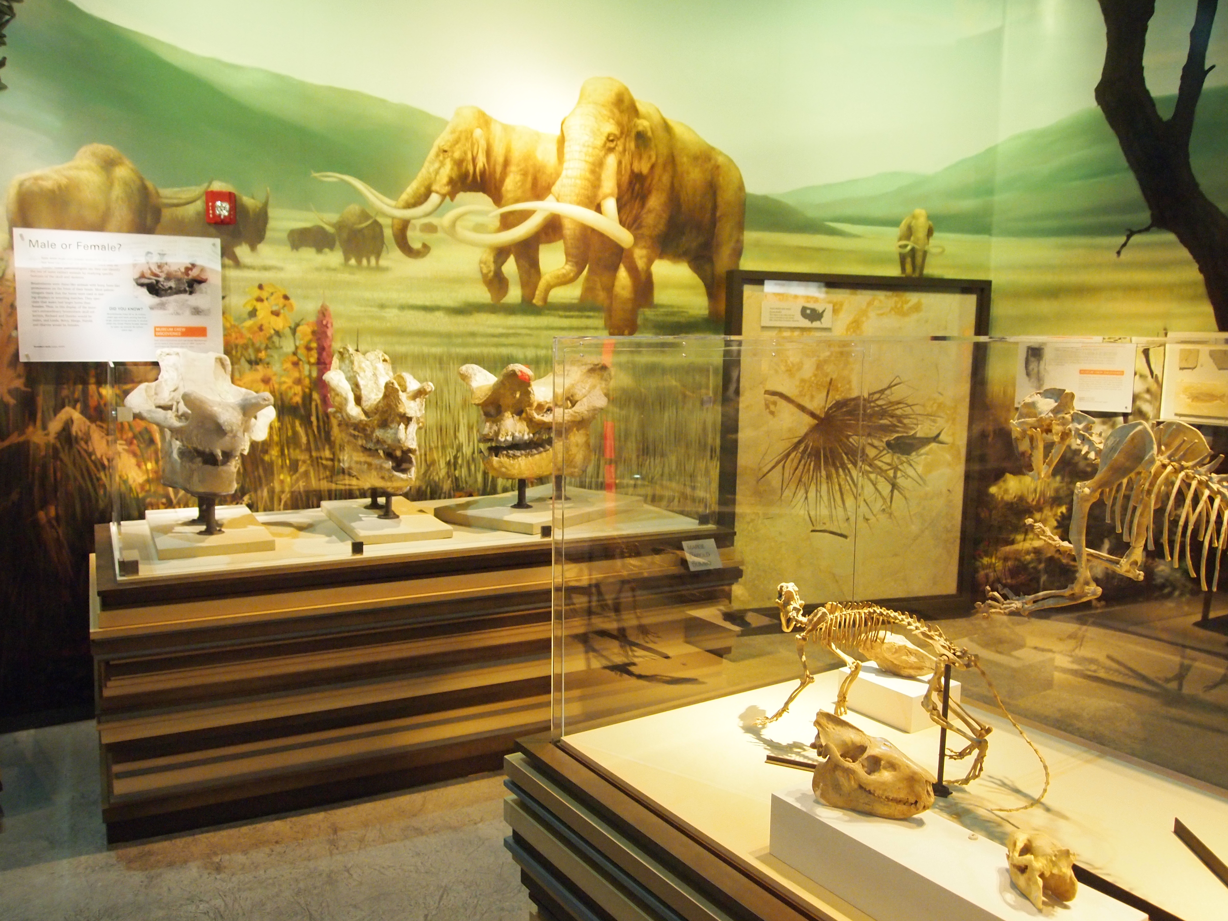
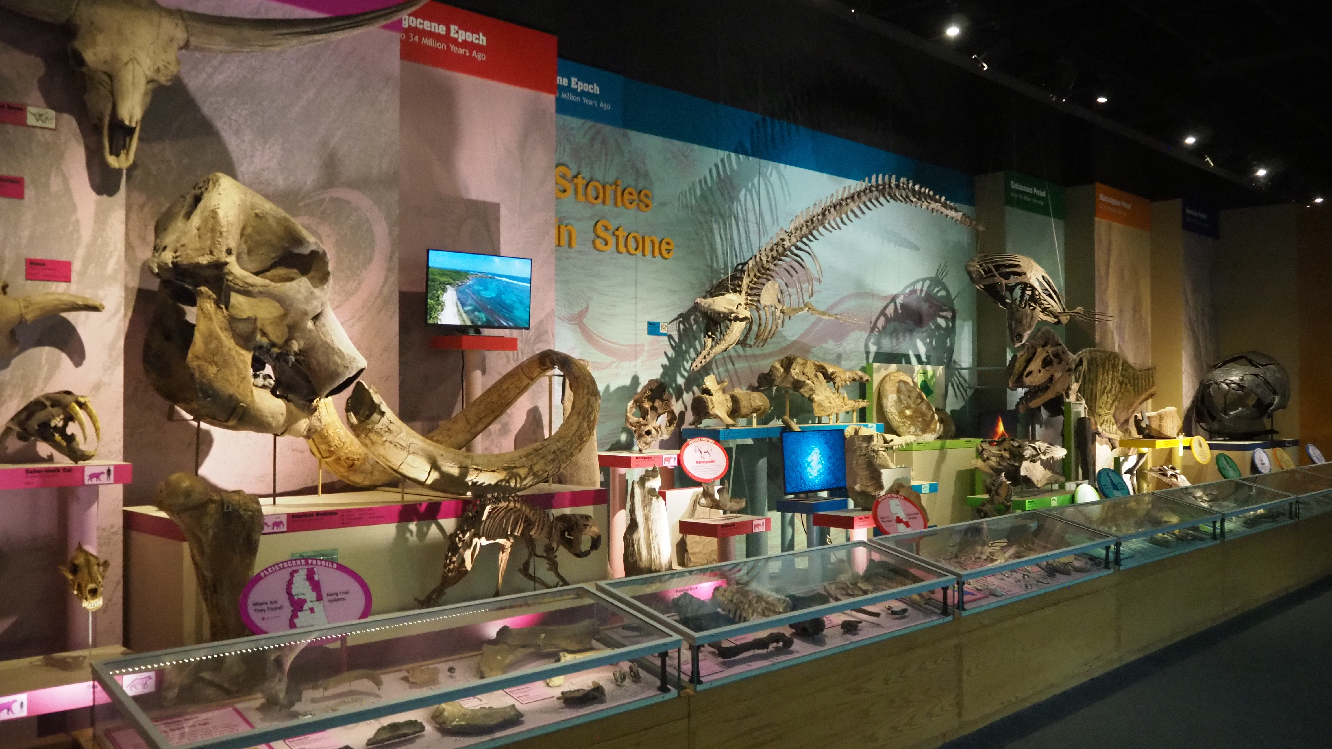
First is the design. Anyone who remembers my ramblings from long ago knows that I HATE this ultra-modern aesthetic. The sleek i-pod look is just so boring. It’s devoid of any character and feels like some sterile tomb. It completely fails to bring the past to life, which is the most important thing to drive home with a paleontology exhibit: these fossils aren’t a bunch of cool rocks. They represent living, breathing animals. It’s not just that its bland and boring.
For example:
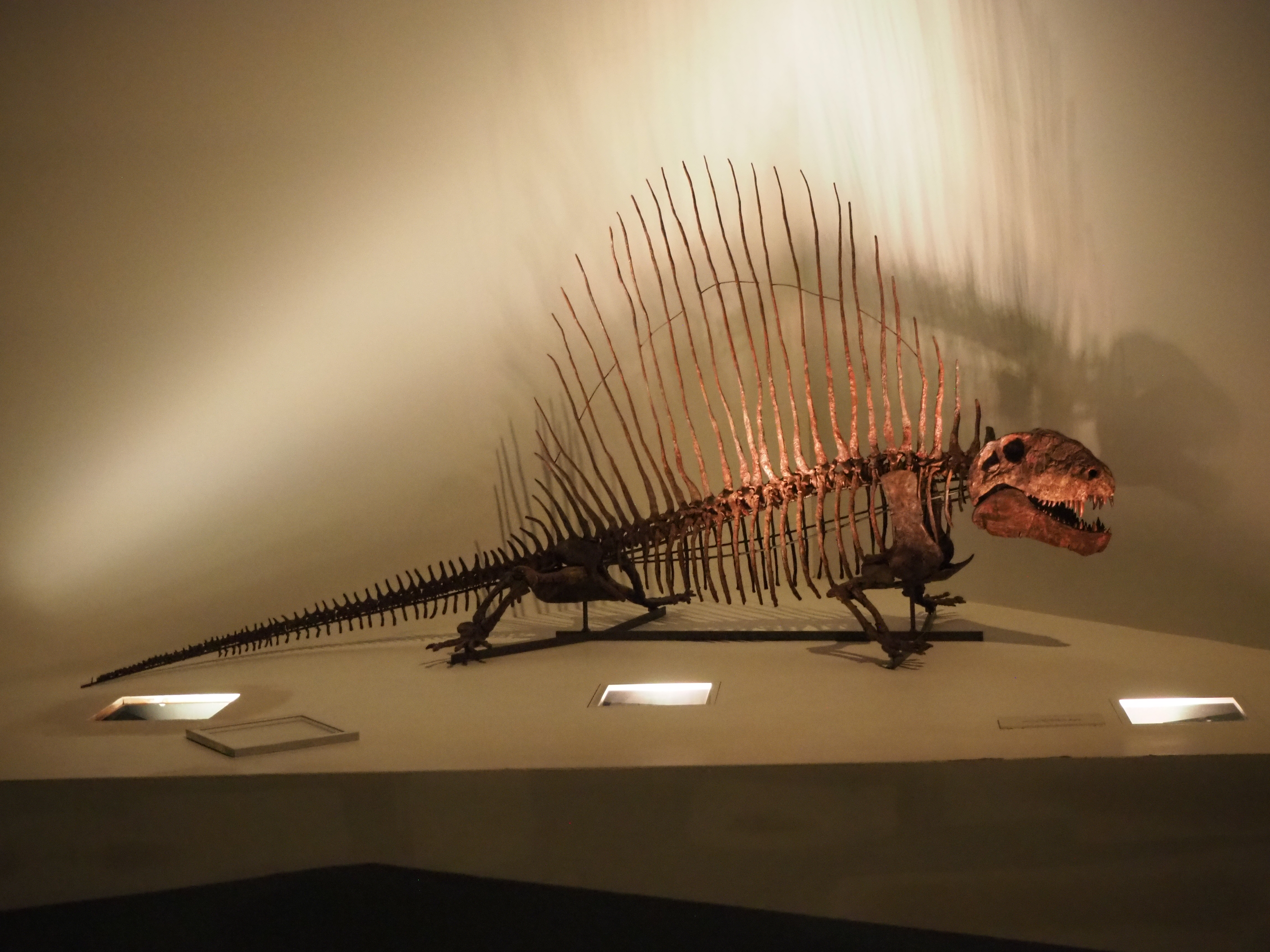
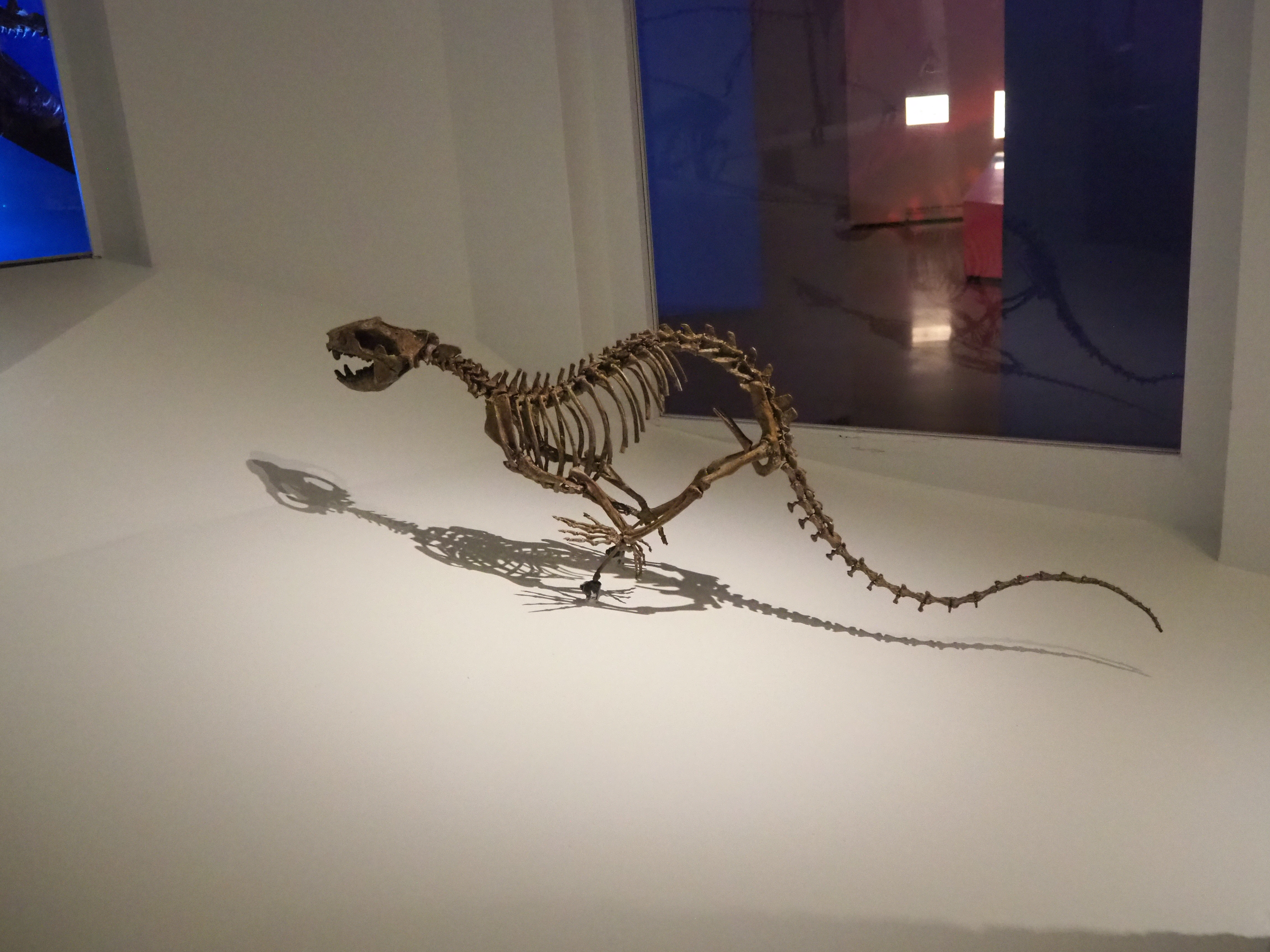
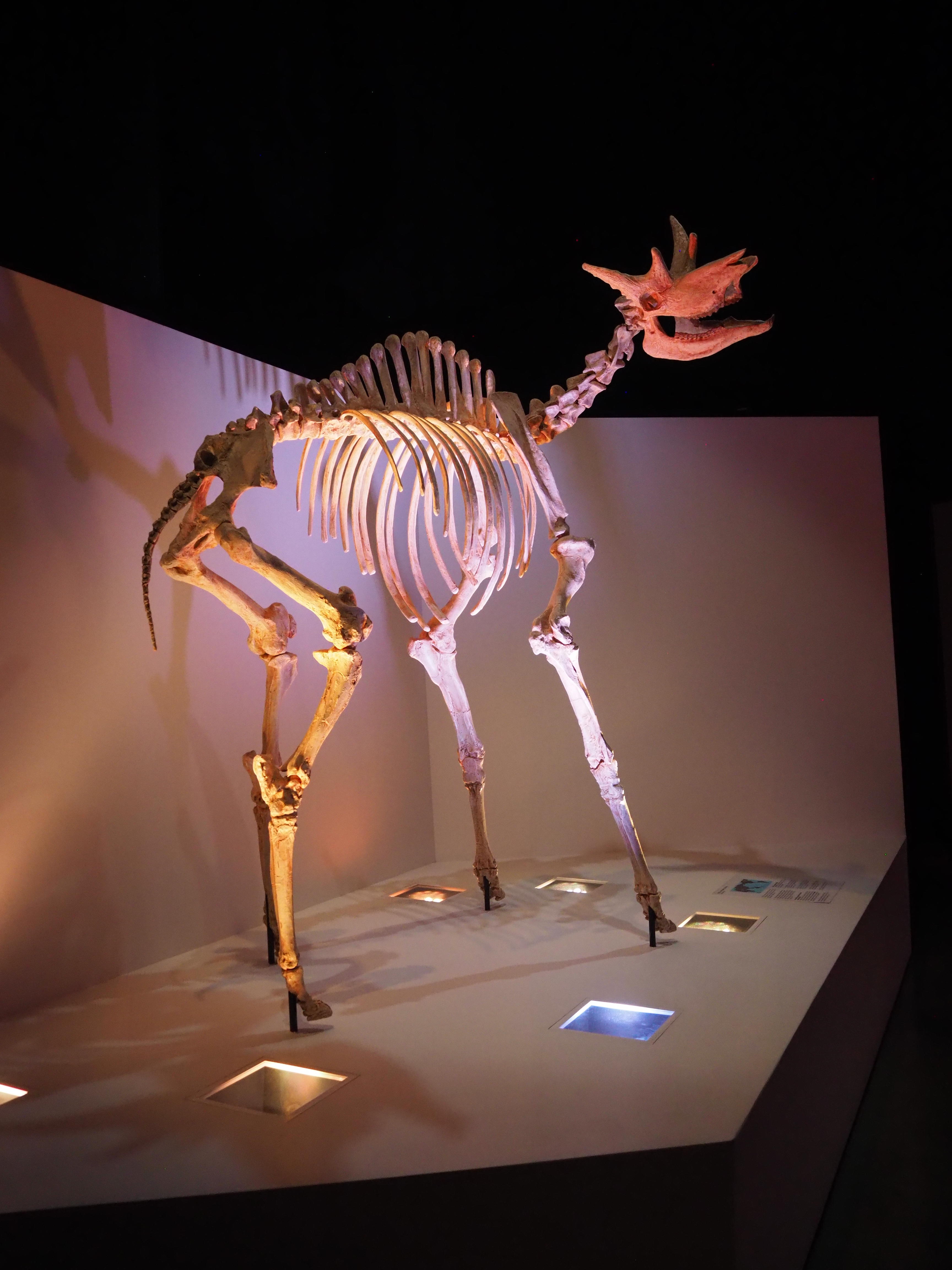
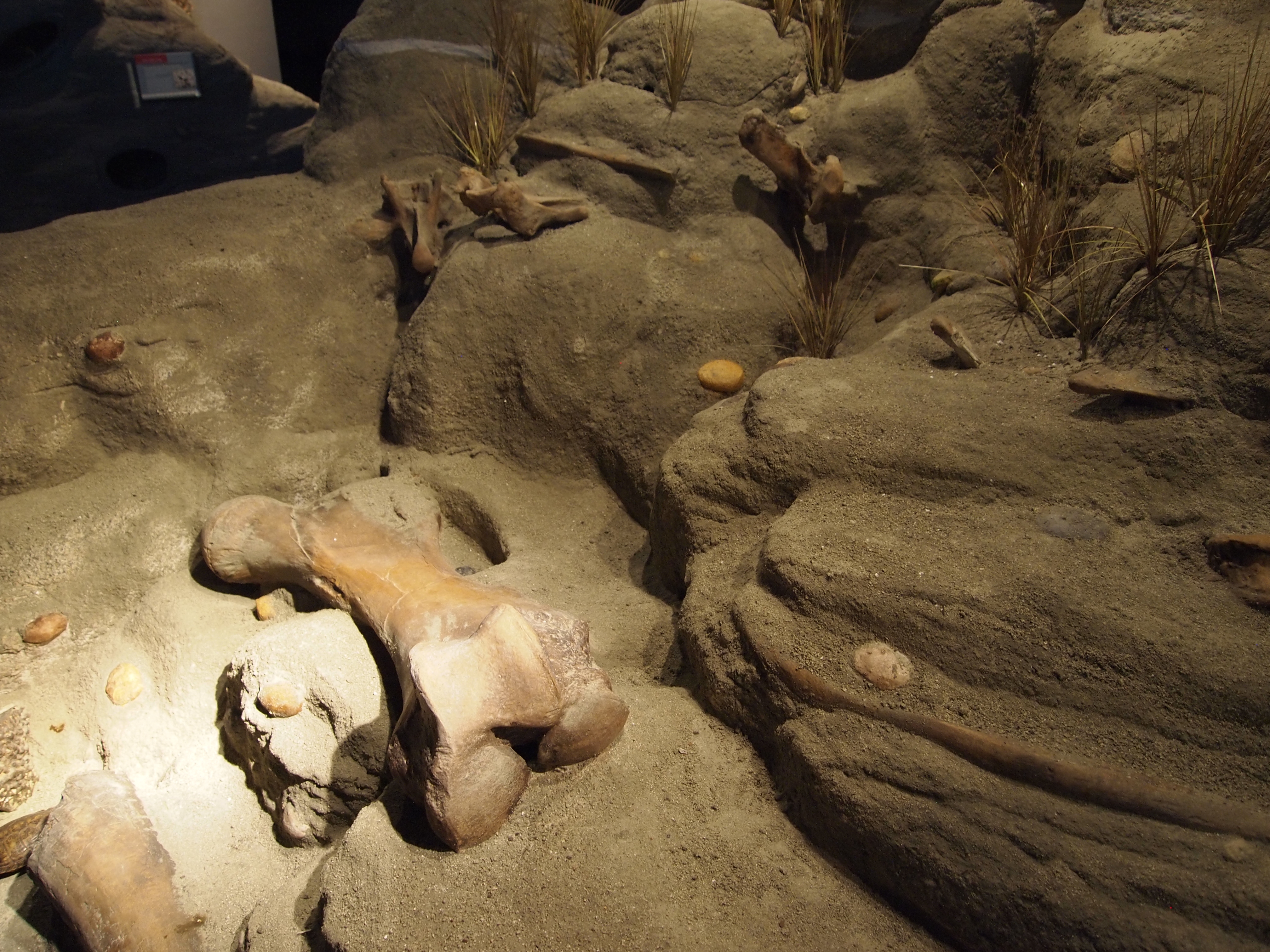
Huge empty voids devoid of any charm, mystic, wonder, or even substance. It’s like drawing something in the middle of a blank piece of paper. It just feels off. Compare the above with the exhibit “Life, Death, and Discovery” at the San Bernardino County Museum:
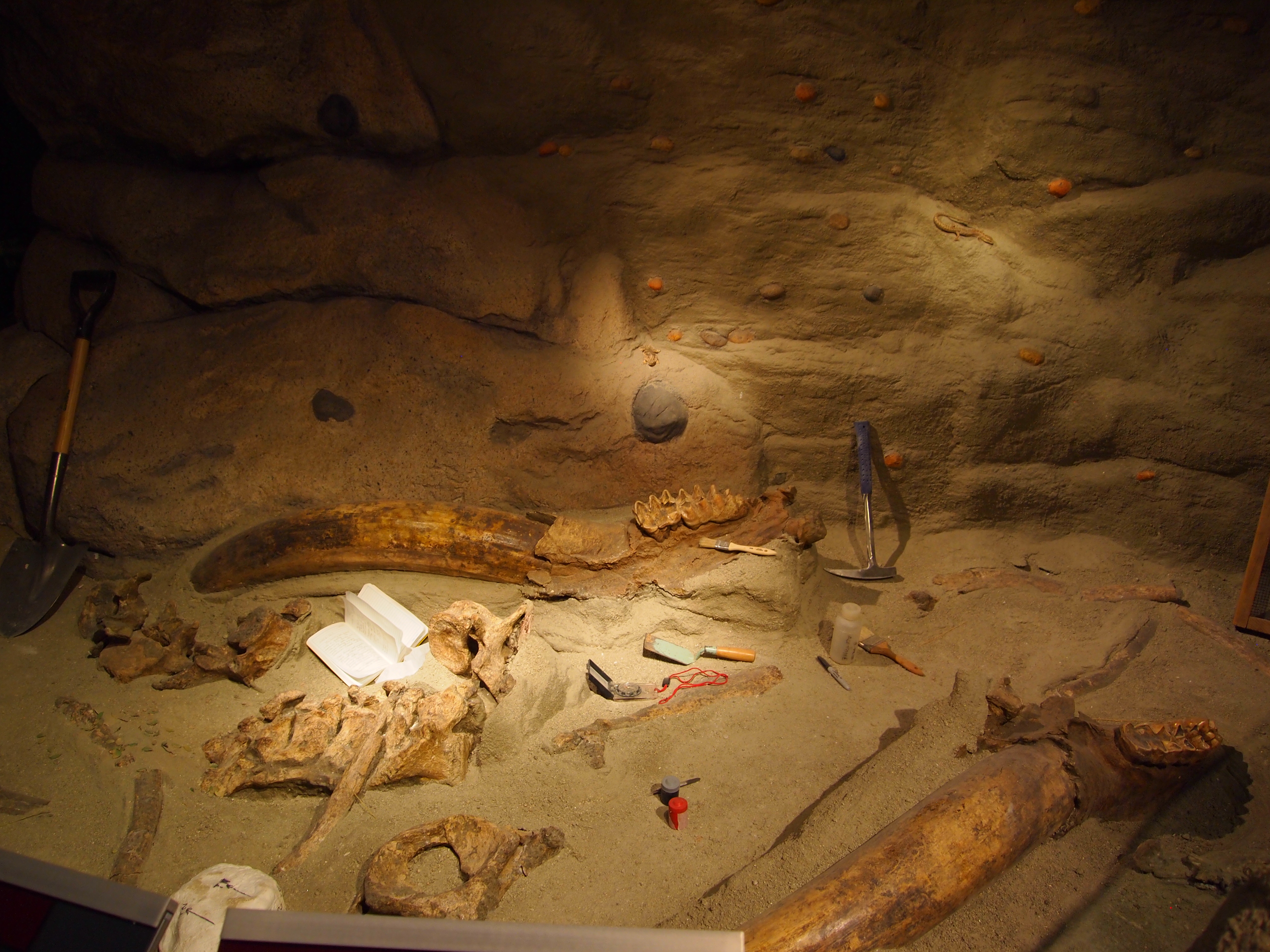
Many would just write it off as another diorama. Its anything but. It is a full scale walk through of the journey extincts animal took to get to our modern world. It starts with the animals in their world (Life), then their bones being buried by a stream (Death), and then the actual fossils in a recreated dig site. Its highly immersive and illustrates the steps in unparalleled detail. It is doing so much more than just showing stuff.
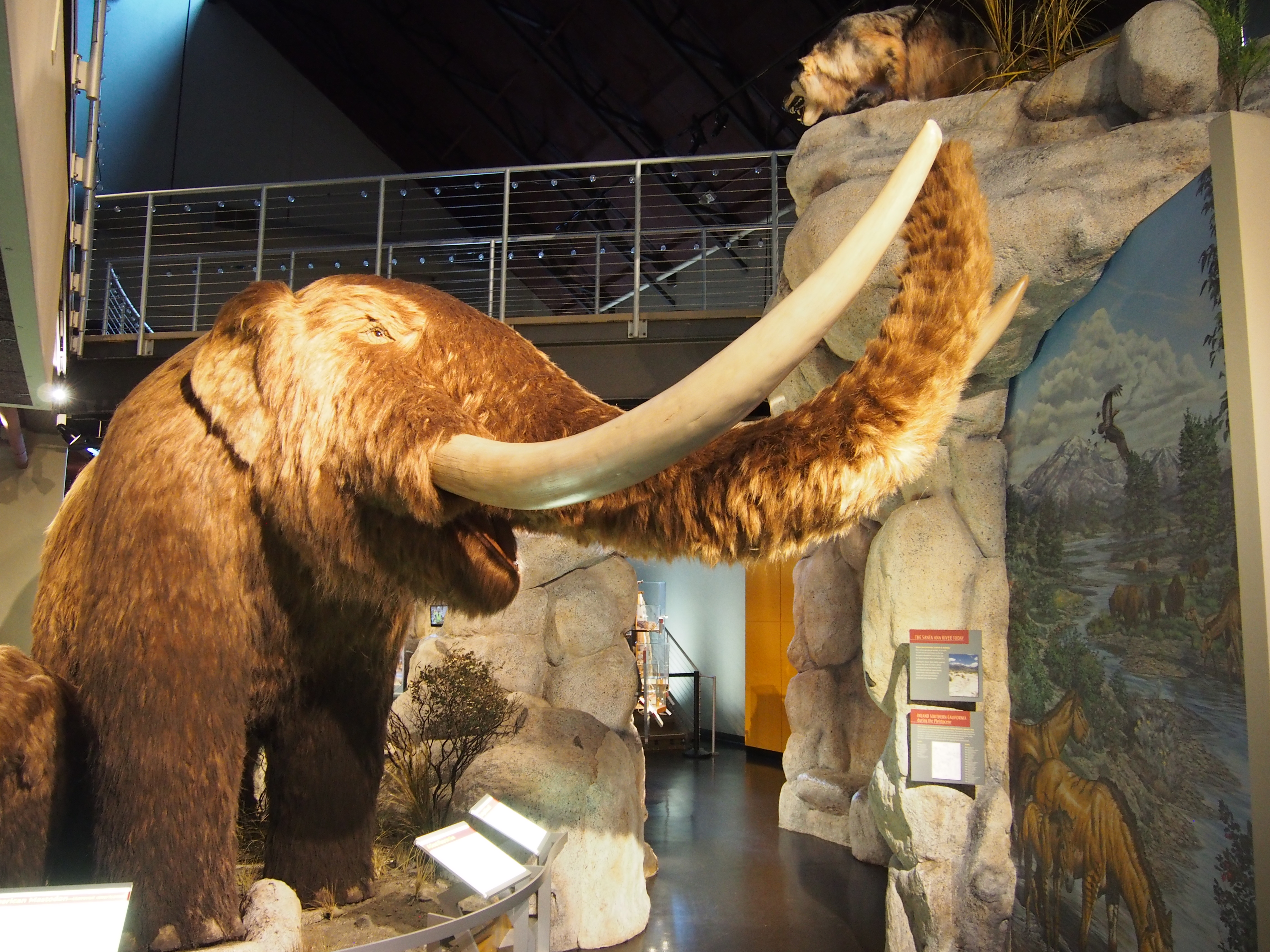
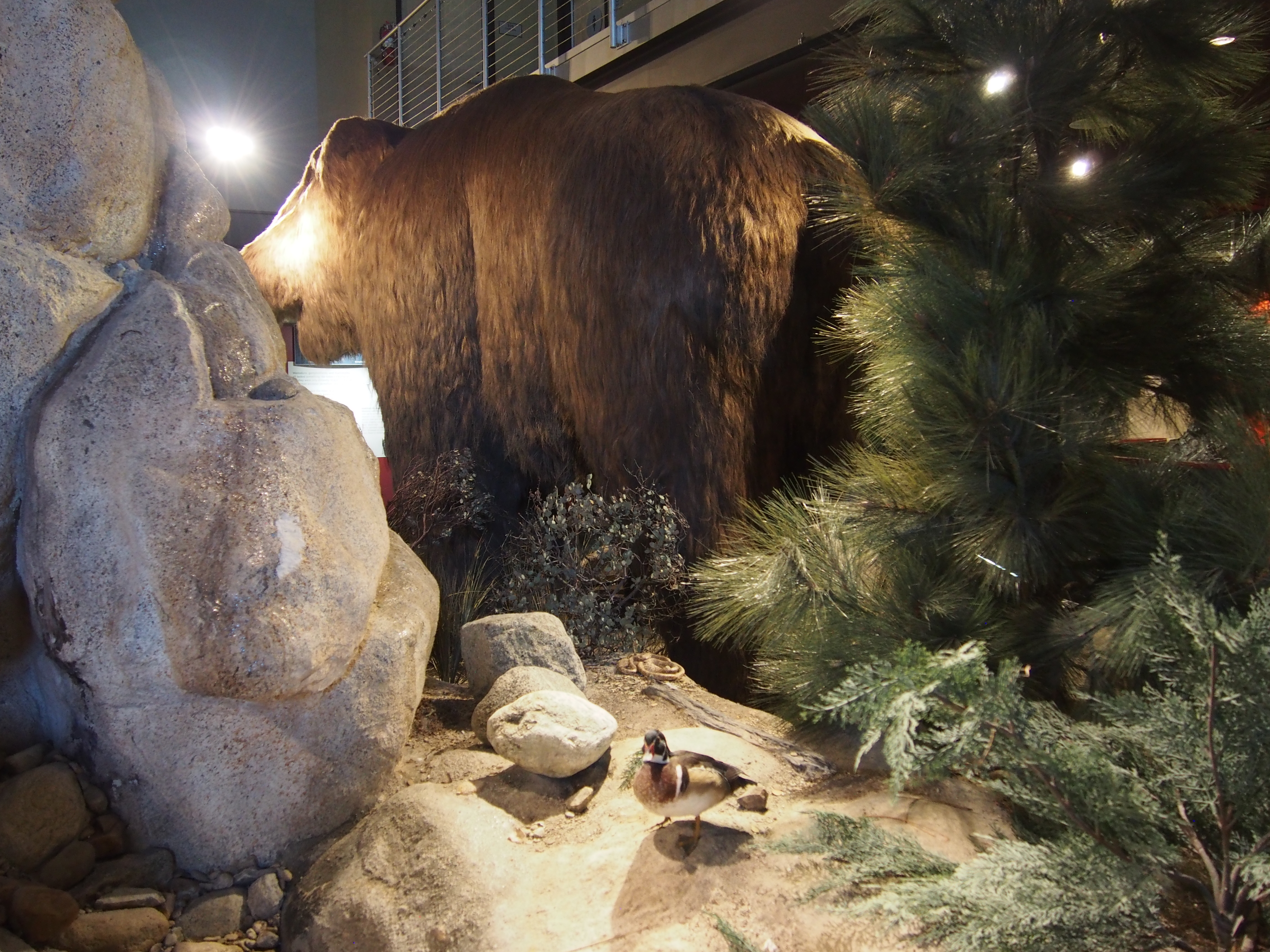
But what if you don’t have the means to create something like that?I have said before and continue to say: you don’t need dioramas to create and immersive and engaging environment. You can use lighting, color, artwork (photos/murals), landscaping and architecture to bring not only the specimens but the space to life. Check out the Raymond Alf Museum of Paleontology in California:
Few skeletons, no dioramas, no recreated environments. But look how lively and inviting it is. It’s a dynamic space that effectively uses lighting, color, and all that other stuff to bring the space alive. They modeled the displays to resemble rock strata! Little touches like that can go a long way when combined with other elements.
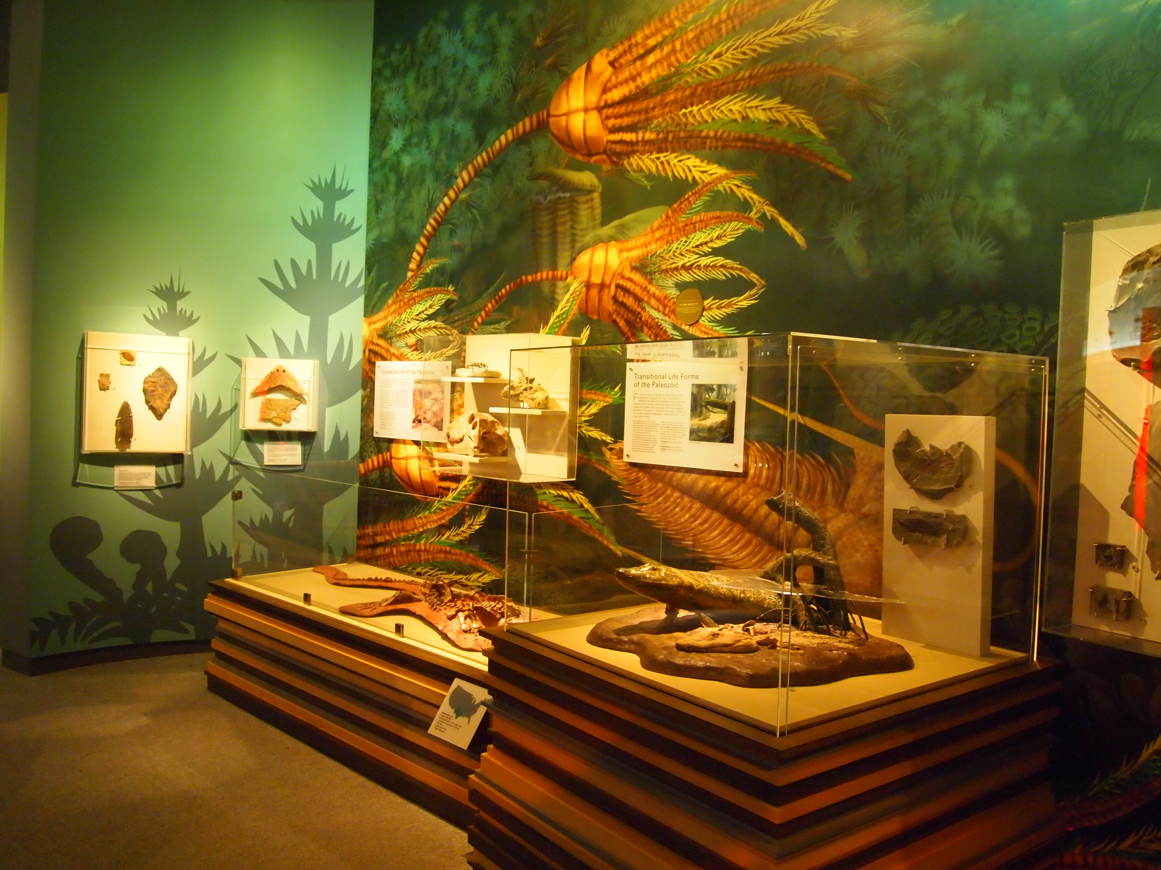
Or the fossil display at the Mississippi Museum of Natural Sciences:
Not at big or elaborate as the big museums or even the ones I just cited. Likely due to a space constraint. But they use color to differentiate each time period, and because they don’t have room for a lot of skeletons they instead employ more actual specimens. The result is an exhibit that while not expansive uses design elements to their best effect to create something more enticing than just a barren slab of white.
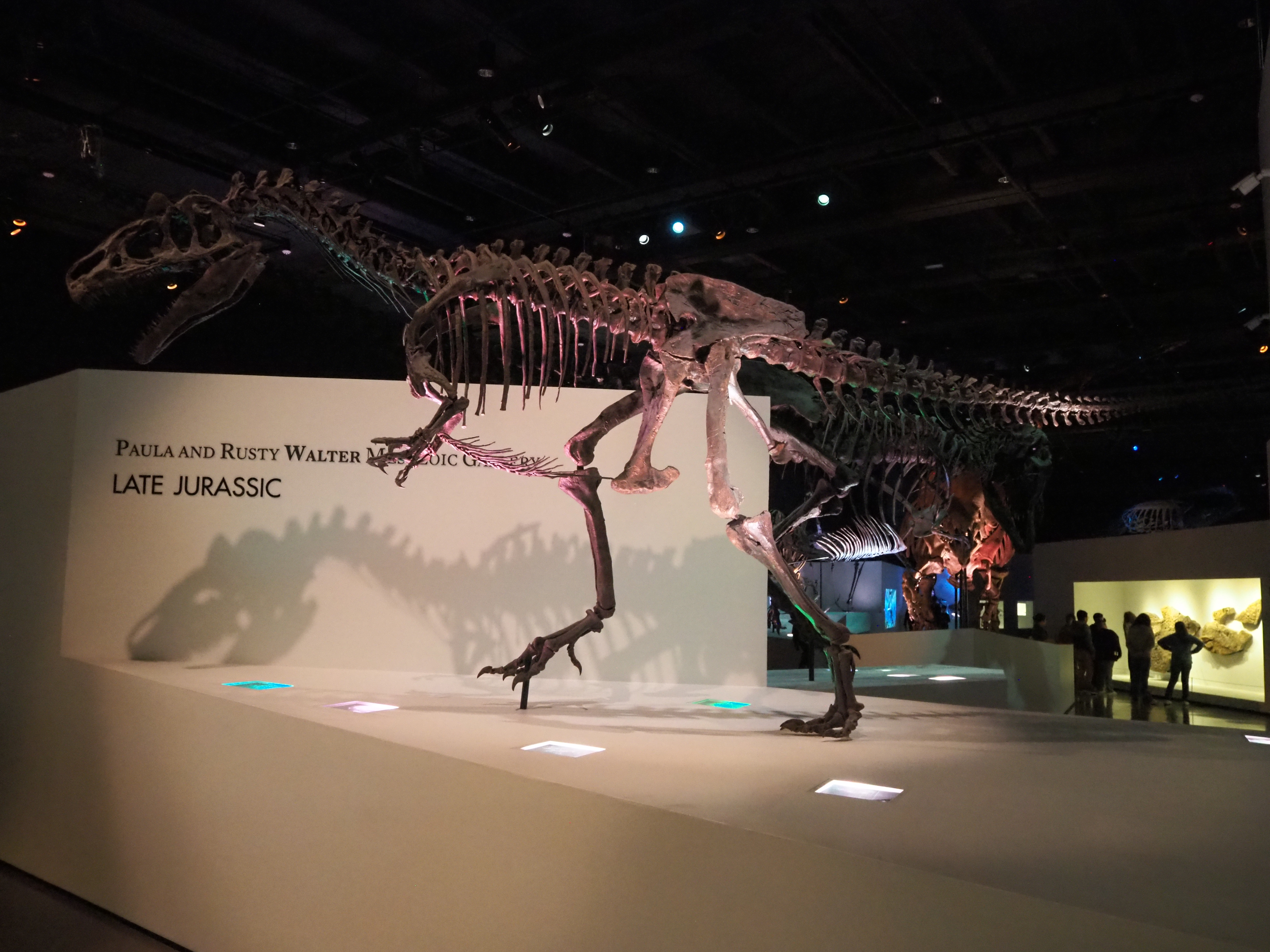
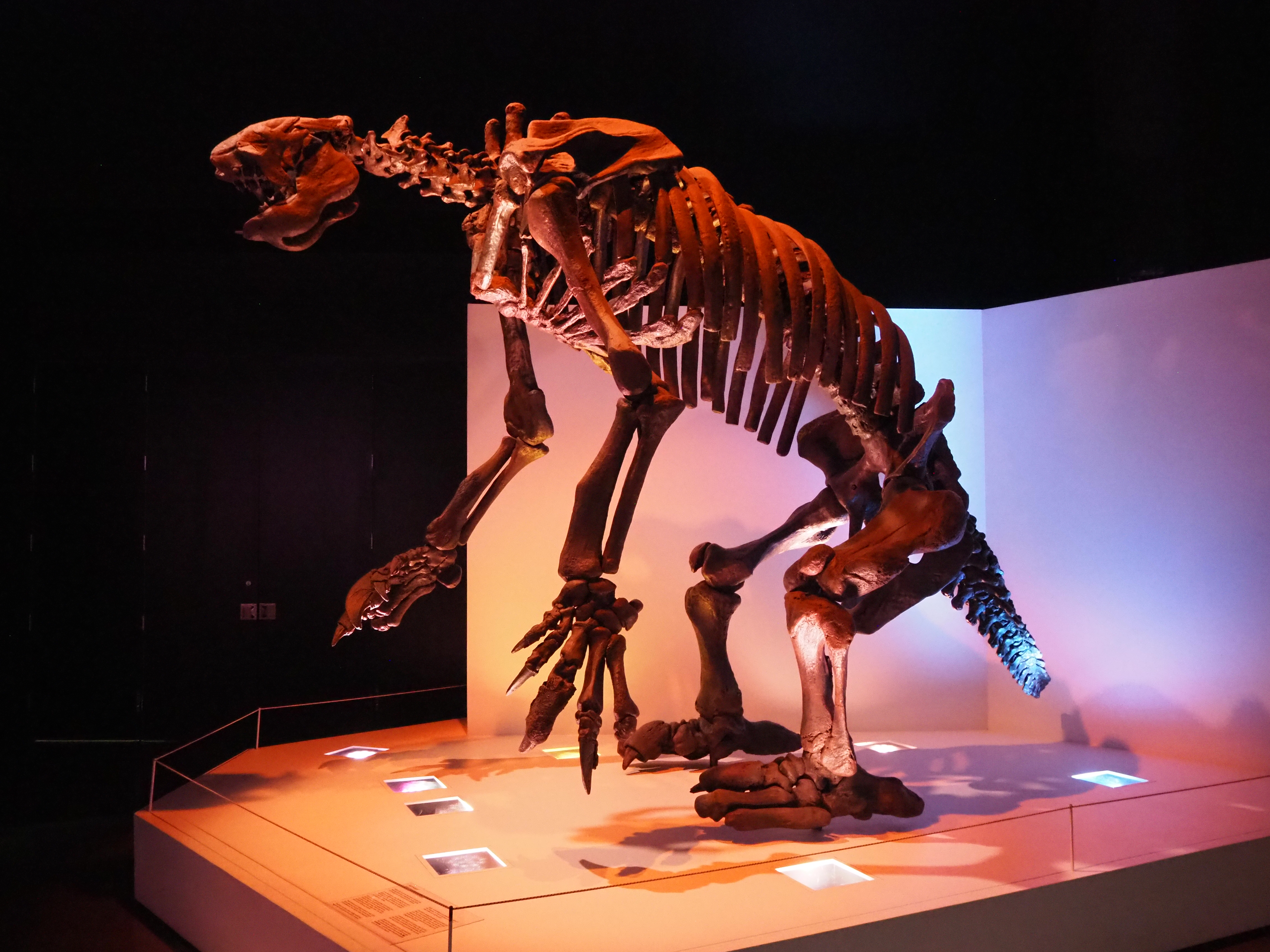
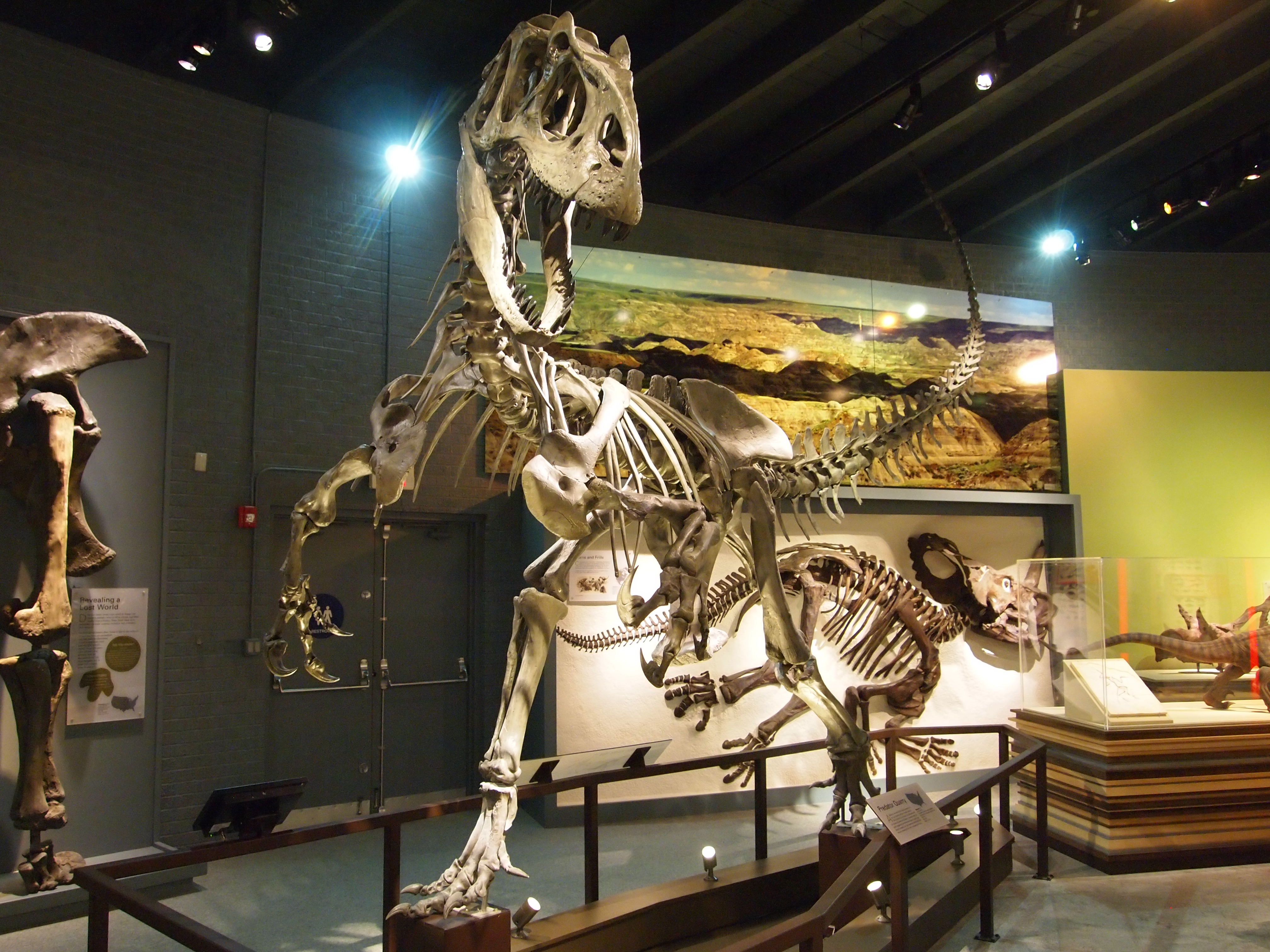
But what about the poses? Don’t they help bring them to life? In fact I was told this on Facebook by some guy from the Smithsonian when I criticized their new paleontology hall:
“You must not have looked very closely at the new hall. We added tons of specimens and casts, and the mounts are now in modern, dynamic positions. You’re entitled to your opinion but please don’t spread fake news.”
Did you hear that? The positions are “modern” and “dynamic” and I say: so what? You’ve stuck them in a bland, boring, sterile tomb of an exhibit. No lighting or landscaping, or anything to enhance the poses. They’re just in poses. What separates that skeleton of a once living animal from a sculpture on a pedestal? From a collector’s model inside a display case? Nothing as far as I can tell. The way I look at it, if you’re not doing anything to help bring the mount to life, then all you’re doing is just putting your action figures in cool poses while it sits on your shelf.
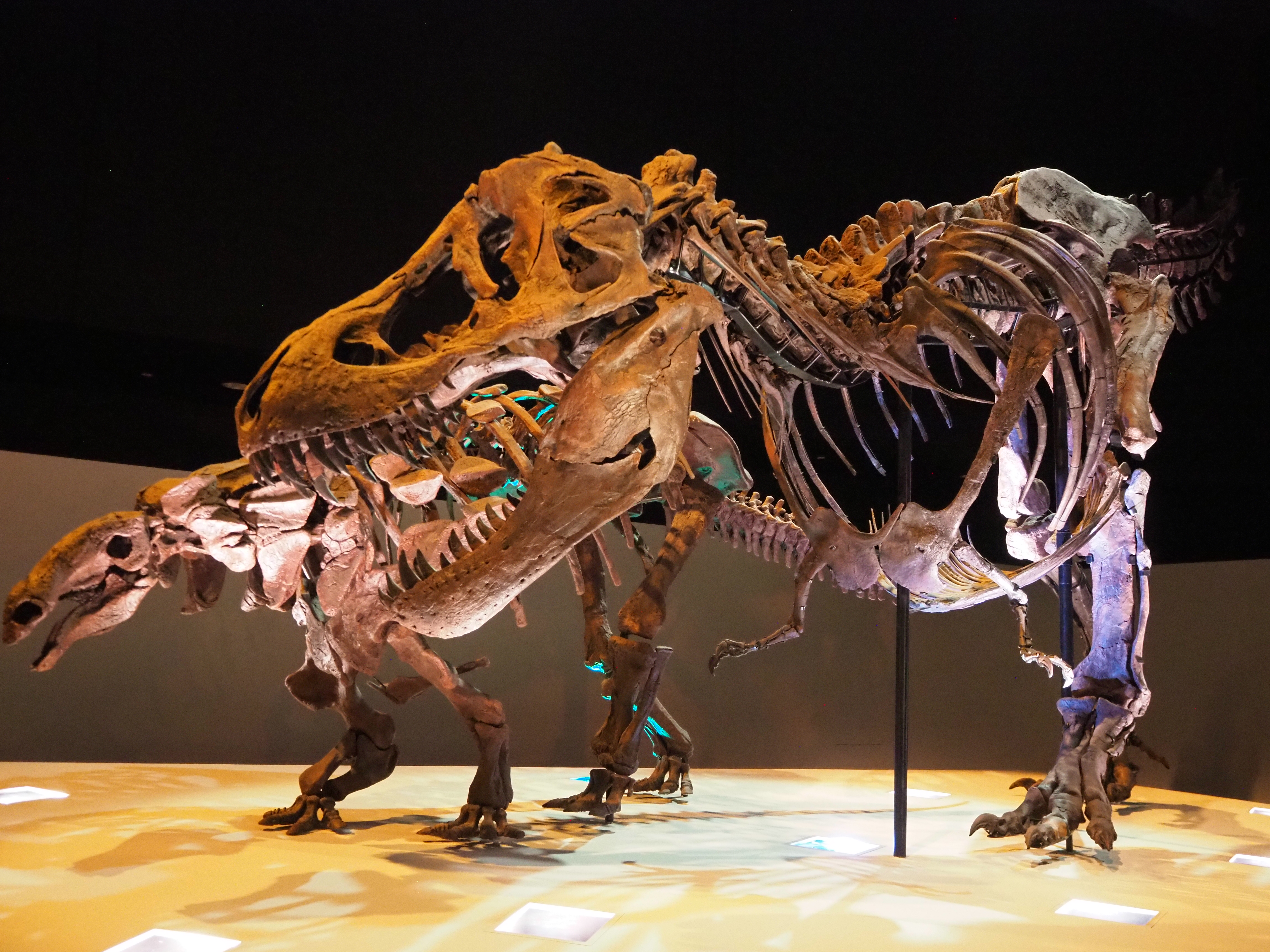
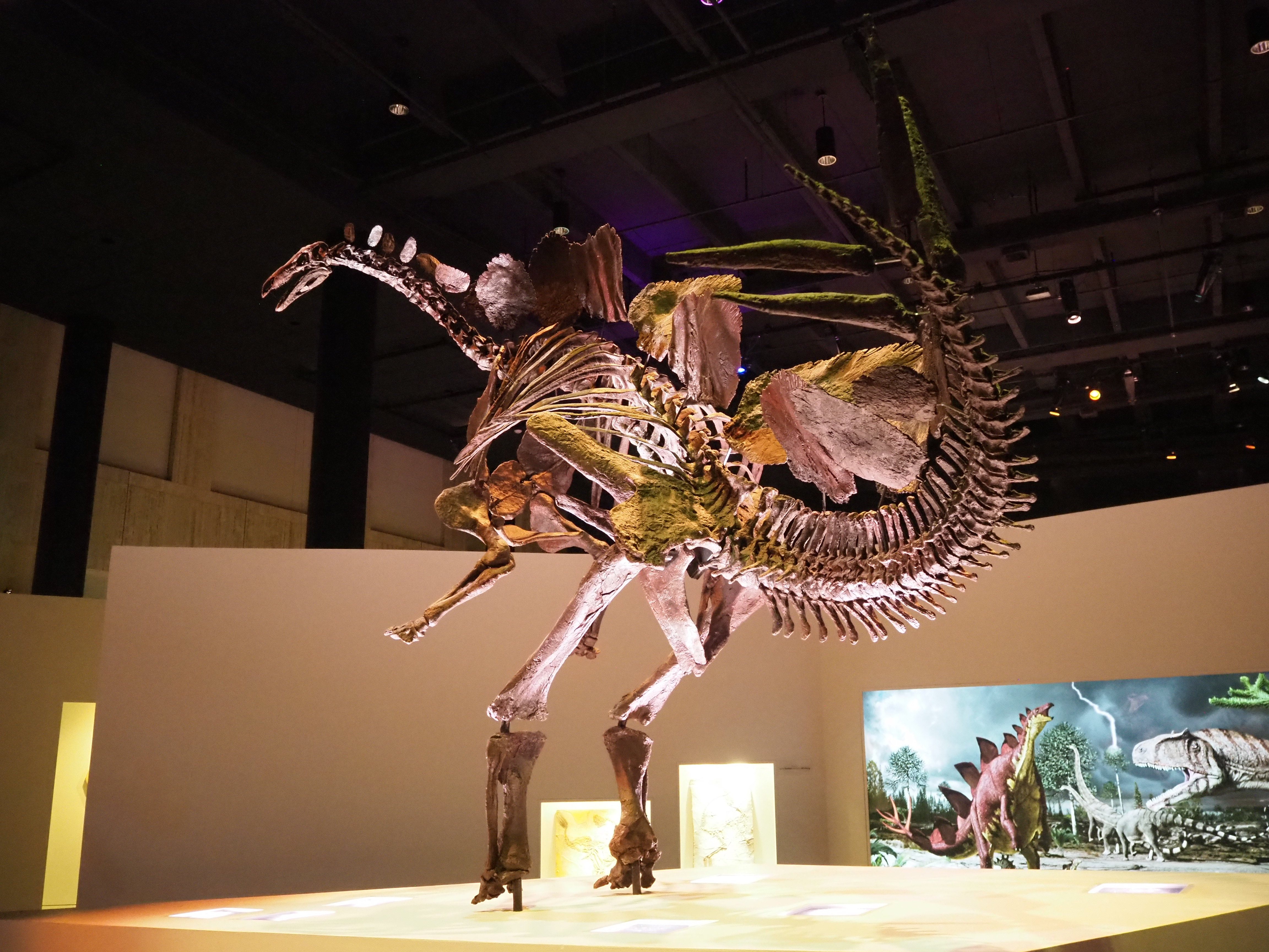
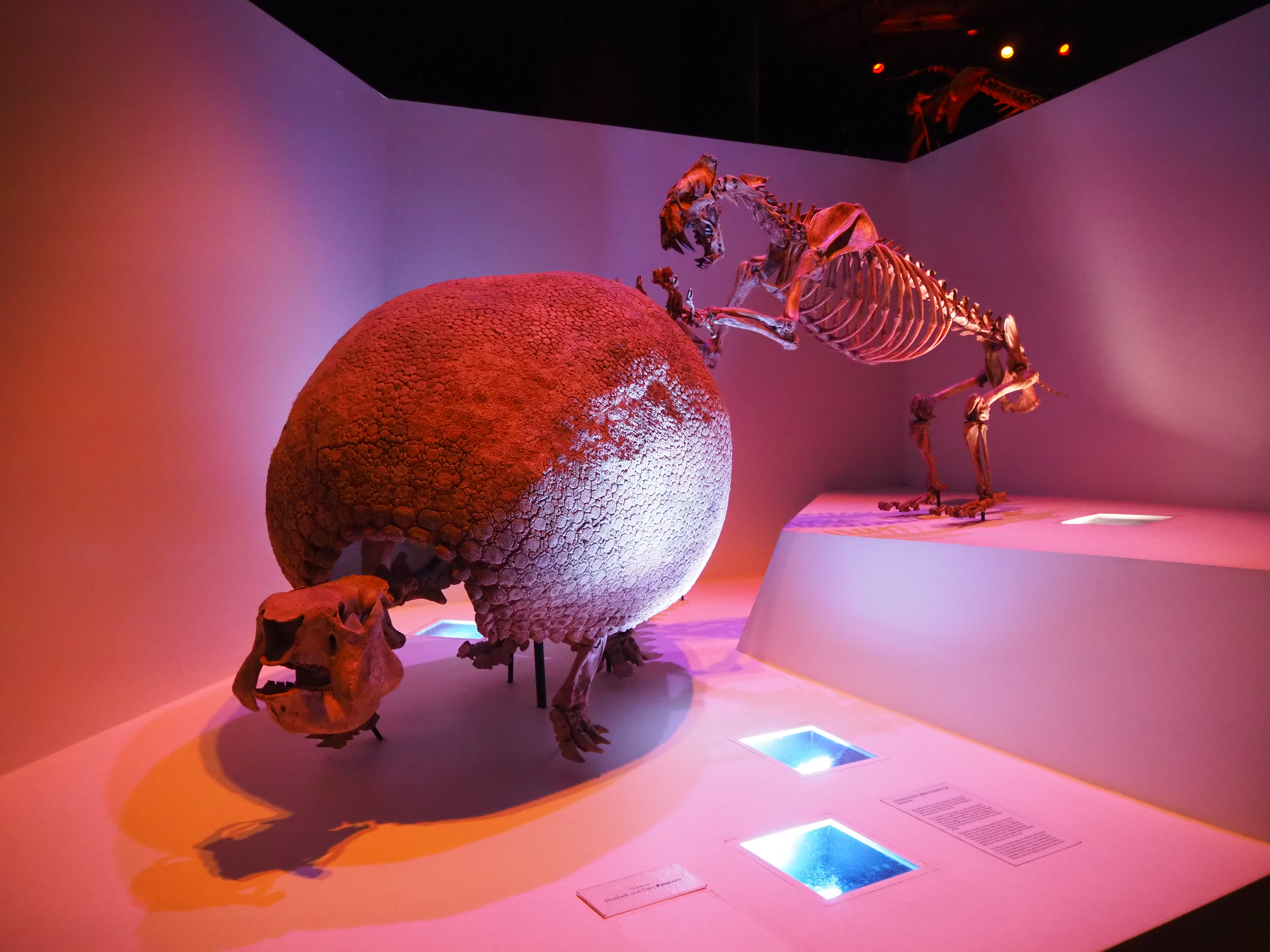
Finally, all the skeletons. Whole skeletons are cool, and have that wow factor. But I never liked the focus on just skeletons with little in the way of individual specimens. I feel it gives visitors the wrong impression: that we only find whole skeletons or that whole skeletons are the only things worth finding. It’s the exact opposite in the fossil record. Plus you are limiting what you can do by only focusing on skeletons. There are specimens that are more important or informative than the most complete pristine skeleton. Because there are far more individual specimens than skeletons, you can be a lot more comprehensive and teach visitors things you couldn’t with skeletons alone. Finally, skeletons take up more space (especially dinosaurs), again limiting what you can do.
As much as I’ve ranted about these design choices they aren’t the biggest problem. The hall suffers from a severe lack of interpretive signage. There is just so little to tell you anything about these animals, how we think they lived, and how they fit into the story of prehistory.
For Christ’s sake, there were many mounts that didn’t even have labels! Never mind learning about something when there’s nothing to even tell you what the hell you’re looking at?
Especially here:
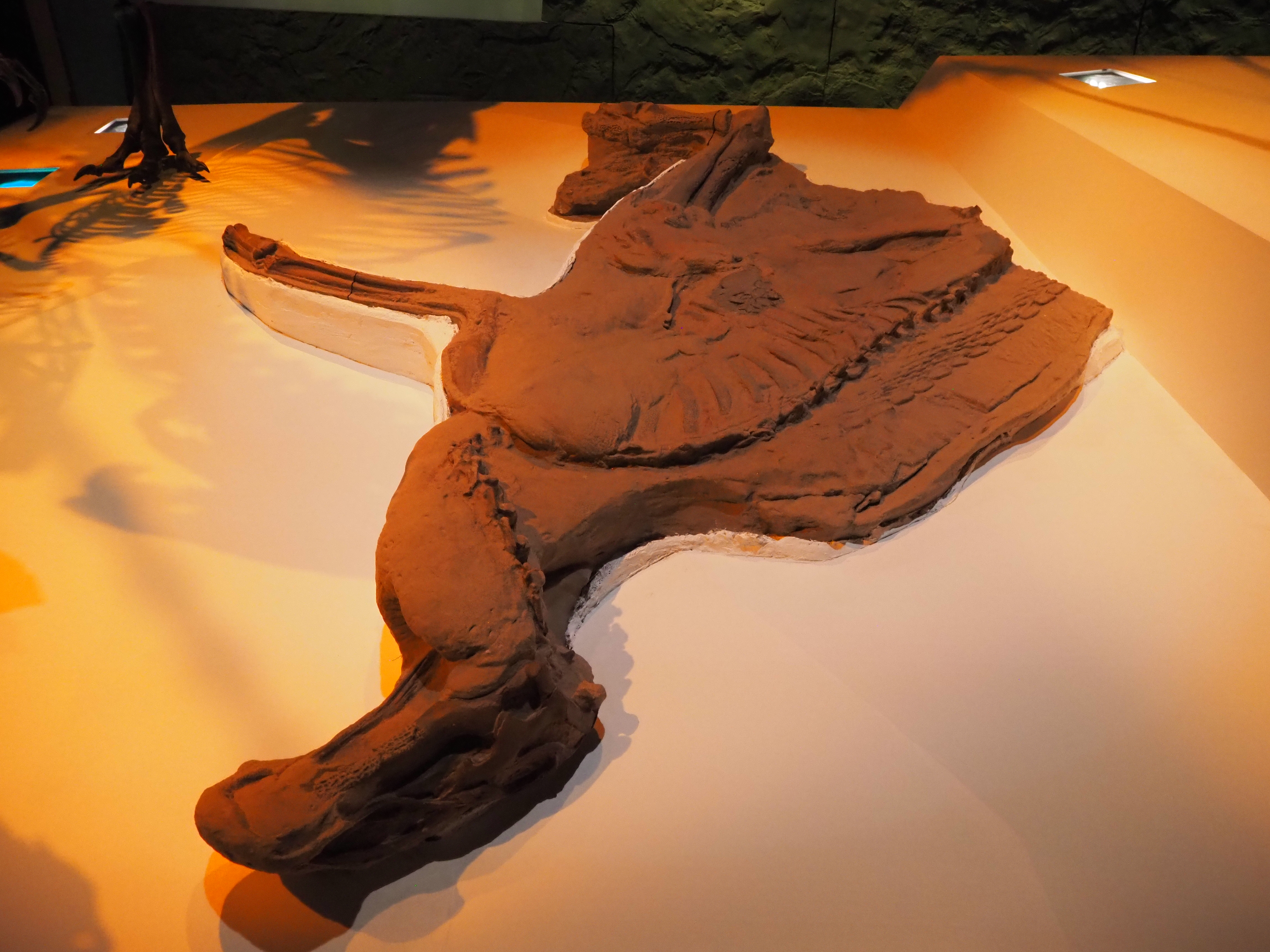
Why, that looks like Leonardo, the famous dino-mummy! Wait, is it? Is it the real Leonardo? Or is it a cast? Hell if I know, they don’t bother to tell us!
So over all, I found the paleontology hall at the Houston Museum to be kinda sub-par. The lack of labels and signs is just ridiculous. The purpose of a museum is to educate them, but if they don’t even know what they are looking at what’s the point? It’s just sloppy and further brings down the experience.
But the design I feel is representative of a wider trend. Ive noticed major museums taking the approach we see here. They want to be “modern”. So they are making exhibits with that sleek ipod design. And they have lots of skeletons in their collection so why not use them, right? The reason I’ve always enjoyed small museums over the big ones is because small museums don’t have the funding or collections of the big ones, so they have to be creative with their design choices.
But the big museums like American, Smithsonian, and Yale’s Peabody museum? They don’t have to be creative. They can just through out a bunch of skeletons because people are so easily impressive by excess and superlatives. They then tell others how amazing the exhibit is and the crowds keep coming. Sure it works, but for a museum buff like me, it just feels like no effort went into the design process. But I don’t design museum exhibits so what do I know.
There other exhibits at the Houston Museum were hit and miss as well. But I wont detail that here because I’ve already bored you with my ranting for long enough.
Till next time (hopefully)
